Page 1 of 4
We need an official logo still
Posted: Fri Oct 21, 2005 2:28 pm
by trahma
Yeah we need a logo. We have a few we've tossed around, I know that o2designs came up with a couple, as well as a few other people. consider this the official logo search thread. Here's the requirements:
1. The file must be given to us in a vector format. Essentially I want to be able to blow it up to run across the side of someons car if they want it. Vector, not raster.
2. It must be single color. If you want to specify an off shade, (i.e. lighter gray) that's fine but we need to be able to put the logo in any color.
Be creative, post up a jpeg of your logo and we'll decide from there.
Posted: Fri Oct 21, 2005 4:20 pm
by HotRodWagon

Here's something simple...since I'm not talented enough to do anything else,lol.
Posted: Sat Oct 22, 2005 10:20 am
by sc0tty8
why not the one on the entry page?
Posted: Sat Oct 22, 2005 12:33 pm
by Sucka612
I like the font of the entry page too. Who's car is that anyways?
Posted: Sat Oct 22, 2005 12:43 pm
by sc0tty8
the front could be a good logo for a hoodie....
Posted: Sat Oct 22, 2005 12:54 pm
by Sucka612
Replace the car if it isn't an mnfoc member.
Posted: Sat Oct 22, 2005 6:34 pm
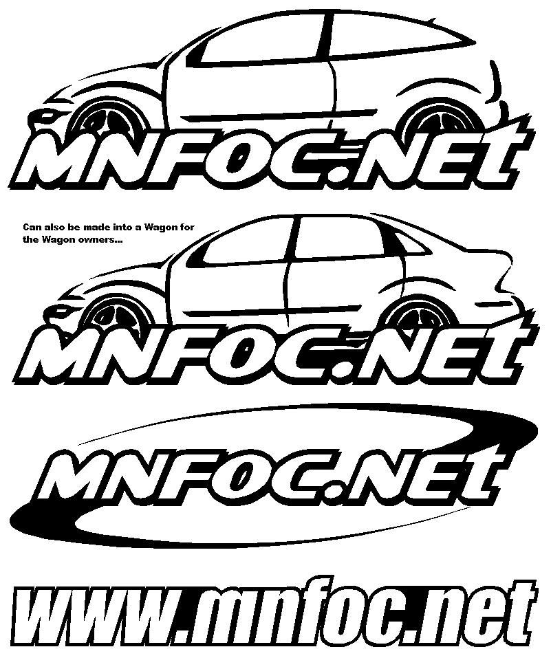
by o2designs
Posted: Sat Oct 22, 2005 7:11 pm
by Sucka612
Those wouldn't look bad on a sweatshirt, but I don't think we could get both sedan and hatch made. I would really buy a sedan one though. If I have time I might try to make something.
Posted: Sat Oct 22, 2005 7:54 pm
by HotRodWagon
Now that's more like it! Nice job

Posted: Sat Oct 22, 2005 11:19 pm
by o2designs
HotRodWagon wrote:
Now that's more like it! Nice job
I am thinking we would need something to justify that mnfoc is related to the Ford Focus. Thats why I thru on the car.
Posted: Sat Oct 22, 2005 11:27 pm
by sc0tty8
On one of the lgogs it shoudl say under the log "minnesota focus owners club" some people need all the help they can get...
Posted: Mon Oct 24, 2005 11:11 pm
by o2designs
Maybe this one will be alittle better. I know its alot like the ffoc.couk site logo, but hey, its a cool logo. Plus it helps kind of gets the "Focus" idea out there...

Posted: Tue Oct 25, 2005 7:19 am
by Pappy
make an white version on that one with no fading, for decals. That would look awesome!
Nils
Posted: Tue Oct 25, 2005 1:49 pm
by Sucka612
I like it.

Posted: Tue Oct 25, 2005 2:11 pm
by thenamessean04
there is way too much going on. I think it should be more simple.